Brand identity & packaging
Morrow.
Rooted in nature
THE IDEA
Design with a clear intention.
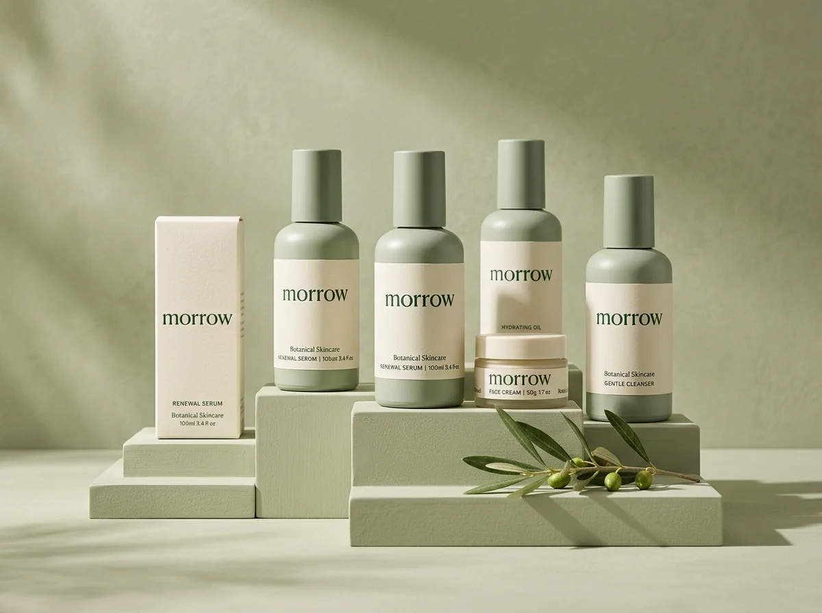
A self-initiated identity and packaging exploration for an imagined botanical skincare brand. Morrow brings a quieter, more considered feeling to the everyday ritual of skincare.
The design direction
A restrained sage palette, generous spacing and an elegant lowercase wordmark create a gentle visual language. The concept explores how a consistent identity can work across bottles, jars and cartons without competing with the product itself.
What this concept explores
- Visual identity direction
- Wordmark exploration
- Skincare packaging concept
- Product mockup
Concept visuals were created with AI-assisted mockups to illustrate the design direction. These are not photographs of manufactured products or a record of a client engagement.
HAVE SOMETHING IN MIND?
Let’s find your direction.
NEXT CONCEPT